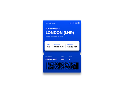
Boarding Pass - Daily UI
Spent some time redesigning the iOS boarding pass for the daily UI challenge and rearranged heirarchy. I travel a decent amount, and I realized that the emphasis in the current design on the departure city, and the lack of any grouping of information makes the boarding pass a little difficult to use when you're in the airport. For my design, I tried to put emphasis on the information I thought would be most important in the moment while navigating the airport, and group information in a logical way (flight number, destination, and date) (gate and boarding information) (traveler and seat info) I thought the gate and boarding information needed the most emphasis, and rest are slightly more secondary once you've arrived at the gate/boarding the plane, and everything is grouped a little more logically in the order in which you're processing the information.
