Form - DailyUI - 082
082/100
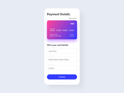
For the "Form" challenge the first thing that came into my mind was a payment page. I tried out a new type of layout inspired by some of the shots here on Dribbble.
The Visa logo doesn't belong to me, I used it to make the composition of a credit card look more appealing.
Link: https://www.brandsoftheworld.com/logo/visa-21
More by Nikita Manko View profile
Like
