X Icon @ Logo Design Process
* LOGO DESIGN PROCESS * Branding for a Real Estate Company *
—
This X was made for a company called “X Houses” in english (“X Casas” in portuguese)
—
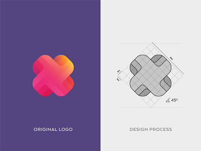
The Letter X and 3D form are the principal concepts. Homes have tridimensional shapes and the letter gives the personality.
—
Guidelines below shows clearly how I made this logo. Is so simple that people will think that it’s seems more complex than they though. The base is a square rotated 45 degrees, with 8px width. The rest is on my Stories, check it.
__
On the top there’s the final result with gradient colors, some brights and shadows.
Client: X Houses ™
—
www.andrepicarra.com
—
My Social Network
Facebook | Instagram | Behance | Twitter | Linkedin
More by André Piçarra View profile
Like

