Passion Project Mark!
I am currently working on a passion project! I have chosen to redesign an app that looks like it is straight out of 2008. I've got my work cut out for me!
The app is about fertility for women. It allows women to track many different signs and symptoms of their cycles and predicts the different cycle phases. I chose this app, because many women believe it is the cream of the crop with predictions. After some research, I have found that many women quit using this app because they get frustrated with the UX and are turned off by the UI.
My next step is to put my new UX/UI design skills to the test. Within the next few weeks, my aim is to have the final UIs, so stay tuned!
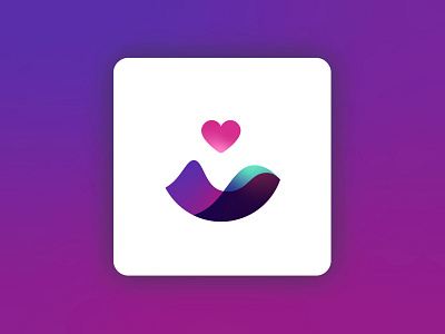
*LOGO RATIONALE*
The previous logo, although has nice elements to it, was messy. It wasn't transferable to different layouts and was hard to read when made smaller.
I didn't want to create a logo that was so far removed from the current one, so I used a couple of elements from it: the heart and the two main colors green and purple. The "waves" are the hormone patterns which happen during a women's cycle. The heart works well for an app like this, as it represent love, family and life - all things that encompassed around fertility. Although I kept the main two colors, I changed their hues and tones to bring them up-to-date. I also included a few other complementary colors to add depth and interest.
