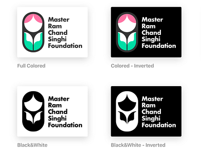
Logo for MRCSF
Another logo for an emerging NGO in Punjab (India) that is working hard to protect and nurture the girl child.
Rationale:
• The logo depicts the girl child. The pink in her hair suggests innocence, playfulness, and feminism.
• A pair of palms support her, opening the pages of a book. • • The vivid sea-green color of the palms denotes care, health, and growth.
• The open, dog-eared pages of the book also double up as "white shirt collars" of her uniform - a sign that she is getting her bit of education. The white collar also suggests the "corporate" that she will grow up to when tended to.
• The bottom shapes further signify two petals of a flower (likely a tulip) that the child will bloom with, spreading brightness, love, and warmth.
• The child is protected by a boundary that surrounds her and insulates her from discrimination and atrocities - letting her grow in her own world.
Design:
• Unlike typical logos, this logo uses a contemporary shape (rounded rectangle) that the new generation will get used to. This adds visual interest and softness to the logo.
• The overall gamut of colors is bright, light and contrasting - denoting the initial phases of life, of transparency and innocence, and the contrasting possibilities it brings with itself.
• The name of the foundation can be used together with the logo or can be dropped. It is optically aligned with the logo to look balanced and impactful.
