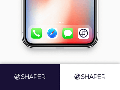
Daily UI #005 - App Icon
Daily UI #005 - App Icon
Initial Thoughts:
When I saw that today’s challenge was to make an app icon, I exhaled sharply through my nose. On the first challenge, more like day 0 when I was prepping, I pre-emptively created an “app icon” or logo for my fake company, Shaper. I will take this opportunity to develop the logo further.
Design:
My interpretation of an app icon is that it is essentially just your company logo mark, and needs to quickly represent your idea in one tiny little box, across multiple devices. Therefore, the readability and success of your logo at small sizes is truly put to the test.
The first round of the logo was underdeveloped and would not work as an app icon. For this round, I focused on reducing the simplicity of the mark while retaining the overall theme and message I am trying to convey. The mission of shaper, to put it simply, is to inspire people to change their lives by practicing mindfulness, visualization, and exercise. I reduced those concepts to 3 shapes and overlapped them, similar to a Venn diagram but with more style.
I kept the logo to very simple colors with high contrast so the design can stand up again any background that someone has on their phone. I borrowed this idea from the approach that Apple and Google have been using for their “get on the app store” buttons.
Takeaway:
I am happy with how the logo for Shaper is evolving, and I think this round is a lot closer to a proper logo mark. When I have some extra time, I would like to develop an in-depth branding guide for Shaper, including a UI Kit and Design System.
--
More about the design challenge:
https://www.dailyui.co/
