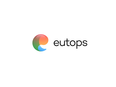
Eutops Logo
Eutops is a beverage brand therefore it’s fitting that the logo is a fluid ‘juicy’ vibrant mark designed to look like the letter ‘e’ for Eutops. The logomark has been designed to be fruity hence the colourful, shiny and attractive look.
We'd love to work on new and exciting projects. Kindly get in touch here - hello@dzisan.com
More by Dzisan Studios View profile
Like
