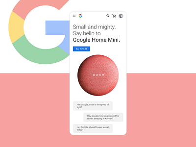
Google Home Mini re-design
Chose the Google Home Mini for the Daily UI #12 (design a product page). A more minimal take on the current Google store for mobile. Used more whitespace while continuing to use material design components.
More by Zeke Kooyer View profile
Like

