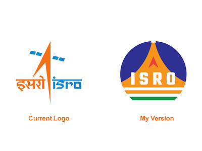
ISRO Logo Redesign
I'm really proud of our scientists and everyone involved. This is a huge achievement for us as a nation. Watching the Live feed of today's mission. I was overwhelmed with pride of being an Indian.
I wanted to do something for ISRO too.
I redesigned their logo. I designed it to be a circular because the shape of current logo is a bit irregular.
Do you like this logo?
Tell me in the comments. :) The circular design will help incorporating it in more places easily like badges, stickers etc.
Meaning of the Logo:
The orange shape in logo signifies the shape of flame made by rocket's boosters.
The upward arrow represents the direction in which we're headed unstopped by any obstruction.
The lines below are colors of our Nation's Flag. 🇮🇳
More by Yogesh Kumar View profile
Like
