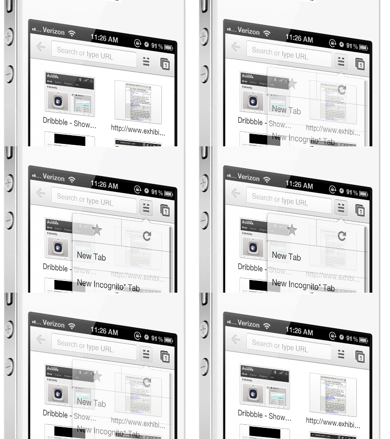
Google Chrome Mobile Idea
Changing the top row of the "more" icon would better represent the additional options that exist below it.
Background: I love Google Chrome on the mobile. However, I never can find the "refresh" or "bookmark". I've had this idea for a while that if the top row of the icon was changed, it may better represent to the user that something different is there. Not the norm, but to me this better represents the menu.
View the original of chrome: chrome.png
What do you think of this idea?
More by Timothy Whalin View profile
Like


