Murcom Branding
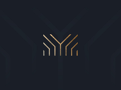
The icon designed is a hybrid mark of uniform structure, elevation, and growth. The architectural shape emulating the M and also evoking the idea of nature with the underlying theme of a Tree. The tree symbolised the growth and eco principals and the rising lines symbolised the structural form. It has a more delicate nature which plays on the ideas of interior design and accuracy.
More by Kieran Duffy View profile
Like
