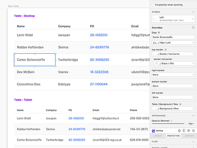
UI Kit - Data Table
Over the last year or so I have been working on a UI kit in my spare time. This UI kit is for internal use only. We use it to jump start UI design projects.
It's evolved from being a personal way to get projects going quickly to something that other designers here use for the same purpose. It's not a big UI kit, it's not complicated, but it is easy to customize and apply our client's branding.
One of my big goals when putting this kit together was to make it as "minimal" as possible. Not in the visual design aspect, but in the symbol, layer style, and text style aspect. For instance, a button (see my previous shot https://dribbble.com/shots/6829341-UI-Kit-Buttons) is ONE symbol. The layer and text style overrides take care of the customization.
Here is an example of a data table using this UI Kit. The table is made from essentially ONE symbol of a table cell. Borders, backgrounds, color, type size, style, is controlled by the overrides. They are versatile but not TOO versatile. I wanted to keep it simple but flexible.
