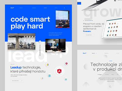
Flow Up – Culture page
FlowUp is the company of our friends from Brno.
They approached us in February last year that they need a new website and my response was "No you need the whole branding from the ground, because your communication and everything is a mess!"
So we started. First, we made a Brand workshop to define who they are and fundamentals of the whole brand and to really understand who they are and how they think about their business and Culture... Good news! Culture is something that is really important and what they value a lot!
Next step. Brand Identity... We had a conception of communication around their name... Everything was UP! FlowUP, MeetUP, LeadUp ... you name it, and around this connection, we made whole communication and brief for new logo and identity. This was the task for Michal Jakubec... the master of branding and true minimalist and he come with the whole idea that the UP has to be upper index. I didn't like in the first, but after a few iterations, we found the final look.
I don't want to talk here about the iterations with FlowUp, because it was sometimes really hard and I thought that my brain gonna BlowUp! :D But we made it cheers!
Next step, Wireframes... it was really smooth and we started with the design of website. Do you remember the UP conception, yeah we used as the main element of the design so every part of design have it's own UP name... so LeadUp stands for Stack and Technology, GrowUp is references and Culture, etc.
The whole design is simple and minimalistic. Strong typography, blue and gray and UP arrow as a symbol... I want you to show deeply a few pages from the whole design to understand how we made it :)
Do you even like it? :D


