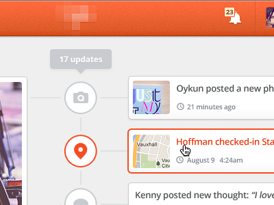
Updates timeline
Hi friends,
Here is how timeline for updates mostly likely will look like at homepage. Group cover block at the left, and updates for it at the right. "17 updates" appears only when you move mouse over any update block. Second update block shows hover state.
Actually this is an early stage design, things will most likely move around. I'm working on this at the moment, and wanted to share as Dribbble tells us : )
Btw, the pixelated thing at top is logo. I must hide it for now.
Comments are much appreciated!
Cheers,
More by Oykun Yilmaz View profile
Like
