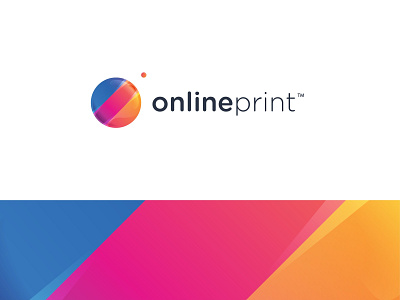
360 onlineprint ™ Logo Design
* FINAL PROPOSAL * REBRANDING FOR 360imprimir *
—
The final result shows a good improvement comparing the actual logo.
—
The Bold and Light fonts chosen are a good design technique to separe two words on a brand name when the naming is too long or the size is not as we desire.
—
The first option was the best because the circle without the hole in the middle are most attractive and easier to read what we want to communicate.
__
Thank you for all the support, comments and love ❤️
—
Client: 360 onlineprint ™
—
www.andrepicarra.com
—
My Social Network
Facebook | Instagram | Behance | Twitter | Linkedin
More by André Piçarra View profile
Like
