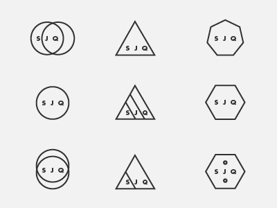
STUDIOJQ - Brand refresh - logomark ideas 2
STUDIOJQ - Brand refresh - logomark ideas 2
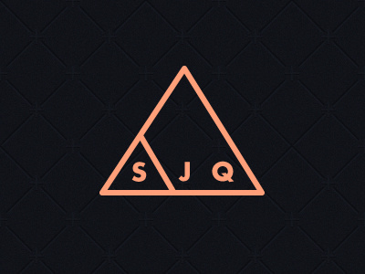
I quite like the development of this mark, as says 'STUDIO' & 'JQ' and it's contained, neat and precise.
I also wanted to use the font weight to be the same as the stroke on the triangle.
Colour wise, am thinking salmon, or astral blue.
Thoughts?
More by MadeByStudioJQ View profile
Like

