L Logo Concept
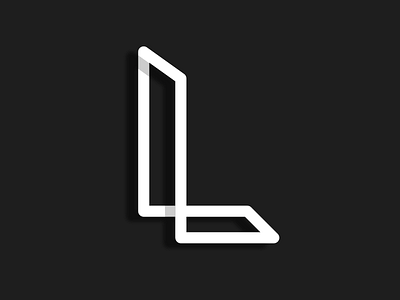
Initial Logo concept that a client wasn't quite happy with, but that I like!
The client's name was with L, but his page contained different content, so was hard to combine them all. So instead of trying, and making a messy design I focused on the name and 3D printed products and made something simple, elegant and possibly 3d printed.
Simple colour choices as well. Picked a dark grey as I find pure black a little grating on the eyes and the contrast is quite good anyways.
