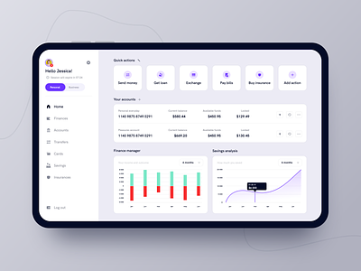
Banking dashboard
For a long time now I've been frustrated with the banking app which I use day to day and I decided to improve the experience.
I analysed their current solutions and benchmarked them against some competition. In the first place I focused on improving information architecture and the overall layout following best practices and gestalt principles.
As you can clearly see my main UI inspiration is material design.
This is an exercise I am doing for fun in my free time to improve my:
- UI
- Research
In couple of weeks I will be dropping more shots from the series and in the end I will drop a .sketch file for those of you who are more curious about this project. Cheers and have a nice week! 🖖
More by Maciej Kownacki View profile
Like

