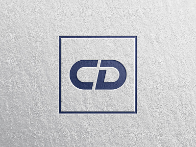
Clear Design - Logo
The story behind my personal brand:
This logo may seem pretty simple at first glance. This isn't just because I'm a fan of utilising a minimalist style, it's also because the logo has subtle, hidden meanings.
The C + D are the prominent letters, but the letter L is also incorporated within the D. The aim here was not for the L to be blatant, but it is purposefully nestled in there as part of the brand identity as a logo specialist. Clear logo design - that's my forté.
The C + D framed in a box also has a second hidden meaning -the lettermark represents how closely I work with my clients; C for client, D for designer - and we're both in the same frame of mind.
Please click the L key on your keyboard if you've enjoyed this post and pop me a message if you're interested in having a brand design consultation.
Useful links:
Website | Instagram | Designer's Tools
