Windows London Calculator
Rushed
We think the current design of calculator app on Windows is a rushed design. It isn't that much taught-fully and carefully designed.
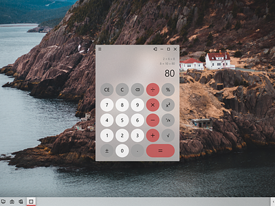
Natural, Clean
Circular buttons and more spacings makes the overall experience natural and clean.
Colors
Differentiating the buttons by their type with colors, help user understand experience better. Also improves discoverability.
Looking forward to your suggestions.
Full story: https://www.behance.net/gallery/81569863/Windows-London-Calculator