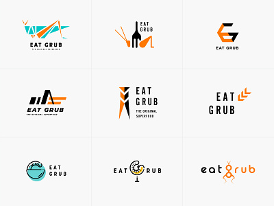
Eat Grub Logos
Which one is your favourite😎?
I’ve been working on a rebranding project for an insect food brand which stands for sustainability (that’s right it is a really sustainable food! 🦗🌱🌍)
The art direction for the logo design was taken to be sporty/street fashion to target teenagers and early 20s referred to background research; accordingly, vibrant, outdoorsy and optimistic colours including orange, turquoise or yellow was chosen to be primary one.
🔎For full project - https://ccydesigntw.myportfolio.com/eat-grub-logo-design
More by Cynthia Hsiao View profile
Like
