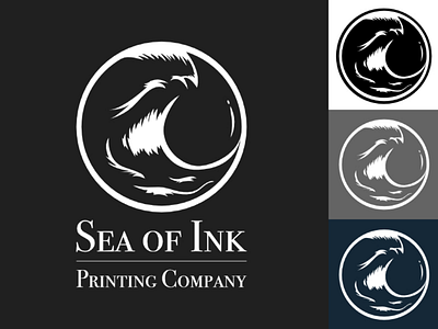
Sea of Ink Printing Company
I really like the way circular logos look. I wanted to make this logo using the rule of thirds the wave takes up 2 thirds of the circle and I used the negative space to create a drop shape. I also made the logo using white and I want it to always be placed on a darker background so that the white parts look like reflections of light on ink waves. I welcome feedback, please let me know your thoughts!
More by Cody Marvin View profile
Like
