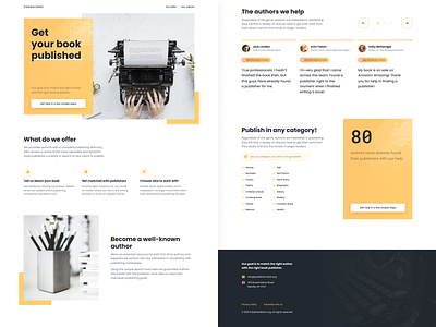
Publisher Match — Survey Form
The agency wants to get the necessary basic information about the author. In order not to scare a potential client with a large number of fields, I suggested using a survey form that will reduce the cognitive load and will be easy and pleasant to fill out.
The cool thing is that its implementation on mobile devices is almost the same as on the desktop version. On mobile, it starts on a separate screen, and on the desktop right in the CTA banner.
Check out the desktop version from my previous shot to see what I mean.
What do you think about this idea and design? Comments are always welcome!
Feel free to follow me on Twitter and Instagram.
Let's design something: anron.kai@gmail.com
More by Anton Lapko View profile
Like


