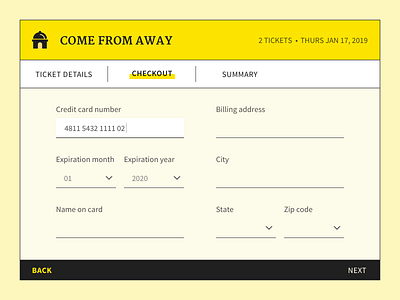
Daily UI 002 - Credit card checkout
The challenge was a credit card checkout form or page, so I took inspiration from one of my favorite treats: watching musicals.
The color palette and typography are inspired by the original playbills — thin black lines, blocky capital serif paired with a clean sans serif, bright yellow. I also love the old-timey "ticket" aesthetic, so I tried to inject some of that in here too.
Among the musicals I watched this past year, Come From Away was my favorite; they had a bazillion tiny details going by in a whirlwind, but the audience always knew where to look and what to focus on. It felt like they'd truly embraced the medium and done the most important thing about live shows: bring your along for the ride. I mean, special effects and hyper-realistic everything are amazing in their own right, but sometimes all you need is a few chairs and a group of people imagining a world so intensely that you see the same things that they see.
