Daily UI #002 - Credit Card Check Out
Daily UI Challenge #002/100 - Credit Card Check Out
Screen 1:
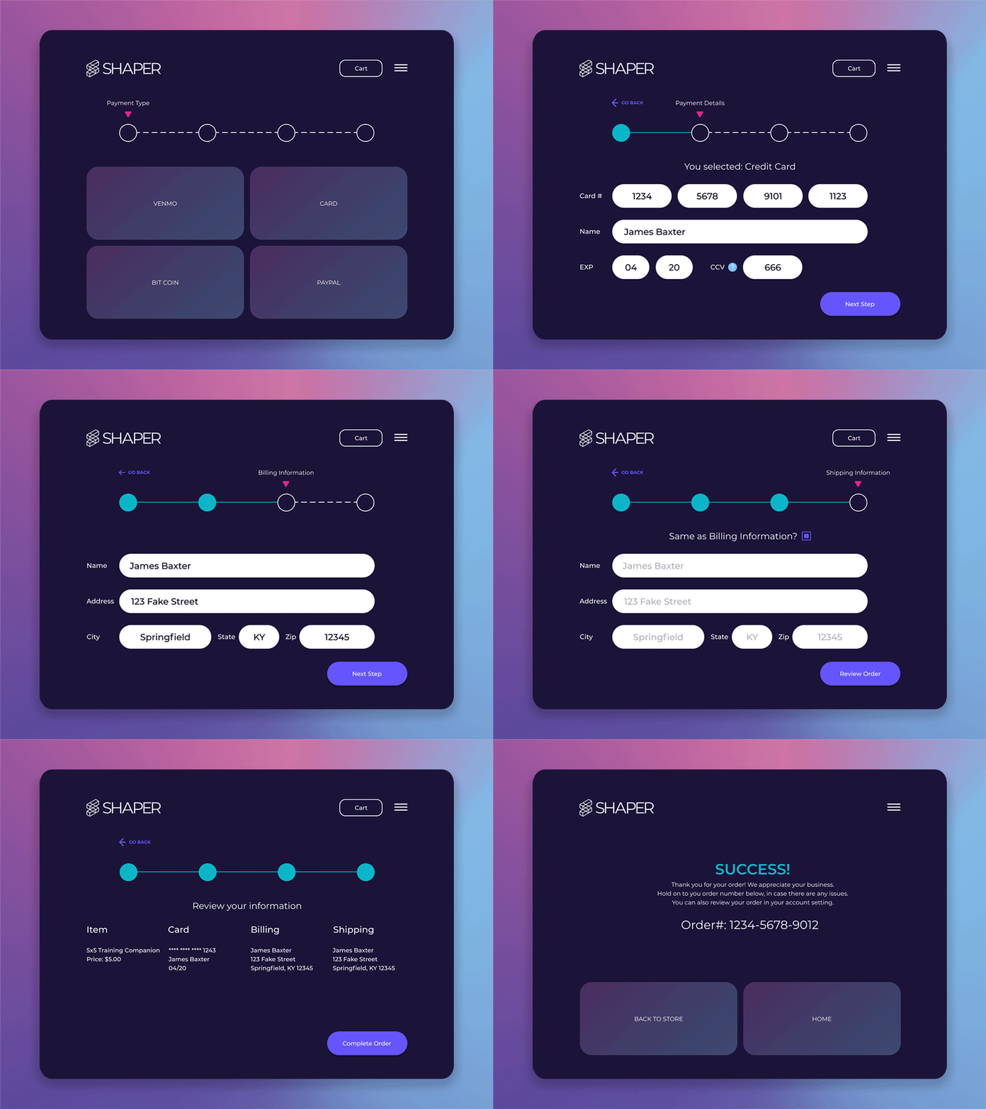
After clicking on a “checkout” button, the user would be presented with this first screen.
The idea behind the layout us that the User can easily select which payment option they want to use, and swiftly proceed with their order. I also wanted to present the user with a progress bar so they know what to expect in the upcoming screens, reducing frustration in the payment process. Also, the “Cart” button appears next to the hamburger menu, and the User can manage their purchases there.
Keeping with the Shaper design system, I borrowed similar elements to the Day 1 challenge and I will continue to refine these styles. Button styles and card styles are starting to shape up, as well as input forms. In this round, a couple more components have also been added: a tooltip, progress bar, secondary buttons, radio button, and a hamburger menu.
Screen 2:
I wanted to keep the number of inputs minimal and intuitive, to promote a stress-free experience, which ties-in to the company mission of Shaper. The input fields are also made very large intentionally and are given a lot of space to breath.
The progress bar advances to give the User a visual representation of where they are at in the buying process. Also, a “go back” button appears in case the User wants to make a different selection. This button is persistent throughout the next screens.
For these layouts, I have displayed the form as if it was already filled out. In a live demo, the User would see gray hint text in the input fields, and the “Next Step” button would be disabled until they complete the form.
Screen 3 / 4:
On these screens, the User will enter their billing and shipping information. More often than not, this information is usually the same. For that reason, I have included a button that will auto-populate the shipping information, if it is identical to the billing information.
Additionally, screen 4’s button says “Review Order” instead of “Next Step” so the User knows exactly what to expect next.
Screen 5:
On this screen, the User can double-check that all their information is correct. If they are satisfied they can click the “Complete Order” button to end the purchasing experience.
Screen 6:
The user is presented with a green success message to make them feel confident in the purchase that they made
Takeaways:
I have felt in the first 2 challenges that I am trying to do things that are too complicated, or maybe to “pie in the sky”. I want to incorporate animations into these layouts, but I don’t want to spend too much time on these challenges. I think one challenge for me will be time management and efficiently executing the high-level designs I am envisioning in my head. I am hoping as I progress in the challenge, I will be able to create and iterate more quickly.
