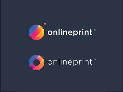
360 onlineprint ™ Logo Guidelines
* GUIDELINES * REBRANDING FOR 360imprimir *
—
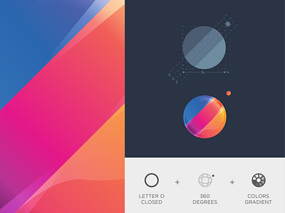
On creation process I’ve to keep clear some keys ideas to preserve the old branding and make a better result with structure guidelines.
—
Letter O of Online, 360 degrees of the initial name and colors gradient are important concepts to maintain on this rebranding.
—
The guidelines on the first icon show how this creation was made. Spacemens and sizes must be pairing.
__
On the left side of the image, there’s the colors gradient detail that I created for this brand.
—
Client: 360 onlineprint ™
—
www.andrepicarra.com
—
My Social Network
Facebook | Instagram | Behance | Twitter | Linkedin
More by André Piçarra View profile
Like

