Mila - Logo Design 💚

Approved Logo re-design for Mila, HEPA filtered air for your home, made simple. 💚
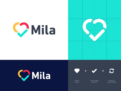
Concept
I've been closely working with my client to find a perfect design which fits their products and brand philosophy. We came out to this heart shaped mark which represents the essence of what Mili stands for. The mark embodies the power of circulating air with love for the protection of your family and close ones and to all live in a healthy environment.
Inspired by Mila
Mila was founded by three dads who lived in Shanghai for over a decade and experienced urban air pollution first-hand. From this they realized how important air purifiers were for the health of their families.
The problem is most people don't understand air purifiers. The science is confusing, the units are expensive, and manufacturers gouge customers on replacement filters. Most customers just buy a single large unit thinking it will cover their whole home. It doesn't. Air purifiers are like air conditioners. You need one for every room, but that gets really expensive.
As entrepreneurs they decided to do something about it. Their goal was to take the complexity out of home air purifiers and make protecting your family’s health easy and affordable. They even named the product Mila after one of their daughters. They wanted to speak to their customers as three fathers, well that and Mila is ridiculously cute ;-)
They hope Mila becomes an important addition to your home, and keeps your family safe, happy, and healthy, like she does theirs.
Learn more about Mila: www.mymila.co (soon get a full online update)
_ _ _
Are you looking for a logo (re)design for your business?
I'd be happy to hear your story! Feel free to reach out!
