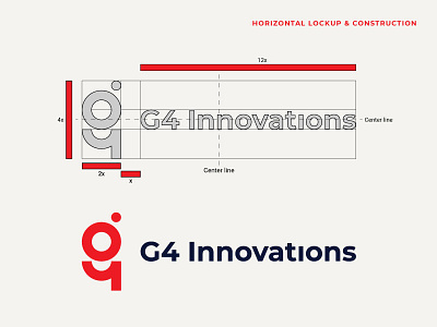
G4 Innovations - horizontal lockup
Here is a follow-up post for the brandmark exploration I uploaded yesterday.
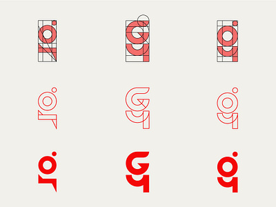
The mark consists of three main elements: letter g + digit 4 + camera. I've made an easier to understand breakdown on:
- my Behance case study: https://bit.ly/2XRShuU
- my Instagram post: https://bit.ly/2NZhxuF
For the typeface, I used Montserrat, a libre sans typeface that was created for the web. The client mentioned that he's looking to stay away from the plain designs and a more formal looking typeface wouldn't have been a good fit. The elegant simplicity of the letters makes this even more suitable for this project because innovation is supposed to make people's lives simpler. I used Montserrat as a foundation and I customized it afterward:
- I took the tittle from the "i" and I used it to create the camera (from the brandmark)
- I adjusted the kerning.
You can find Montserrat on Google Fonts.
The typeface and the mark were behaving well together, but the proportions weren't quite right, therefore I used a grid to add more balance and make the final design look more aesthetically pleasing.

