003 - Landing Page | 100 UI Challenge
003 - Design a landing page
For today, I decided to bend the rules a bit for the prompt. Over the weekend I visited the twitch website for the first time.
My initial thoughts were WOW, there is a ton of content on this homepage - look at all the different categories and streams going on. However... As a brand new user that isn't familiar with the platform, I found the homepage very overwhelming.
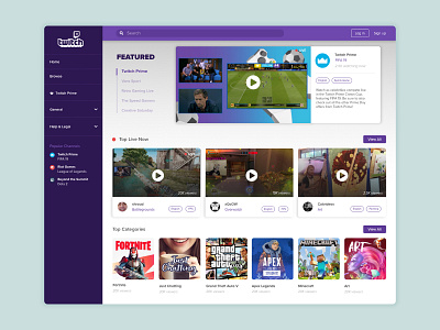
The main area I wanted to approach was the homepage slider. This component is used currently to house any sponsored or paid advertiser streams. The problem with the current solution is that the user cannot see the featured content without scrolling through each slide at a time, and as most people know, this kind of carousel slider, nobody is going to click through.
By showing the titles of the streams on the left hand side, the user can see all the featured content at a glance and click on the item they want to view.
