Quik - Visual Identity - Behance Case Study
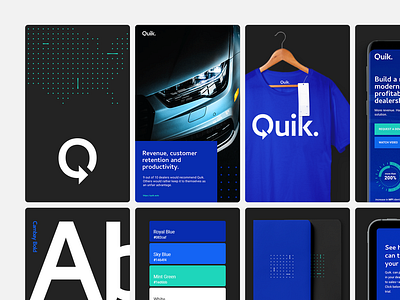
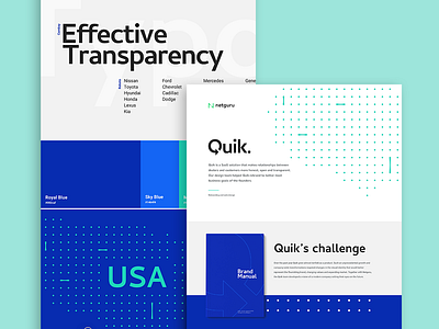
Quik is a SaaS solution that makes relationships between dealers and customers more honest, open and transparent.
As part of the rebranding process, together with our client, we’ve developed a visual identity for Quik that included a new logo, a set of brand colours and fonts, key visuals as well as collateral materials and design for their website and landing pages.
We've recently published a case study on behance and you can check it out here -> https://www.behance.net/gallery/81989525/Quik-Branding-and-Web-Design
Kudos to @Mateusz Nieckarz and @Pawel Utr for their amazing contributions to the project.
We're available for new projects! Drop us a line at branding@netguru.co.
---
Show us love! Press "L".
Want to see more projects? Visit our profile or Netguru.com and remember to follow us!

