DKI Website Pt. 2
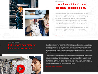
This is the middle section of the DKI website design that I am working on right now. I went with a new modern style with making the middle section by using borders around the top image to showcase some depth and attraction to the type of work is done for the company.
Later on down you notice that there is a dark background section that does the same thing with a video player feature.
More by Brian D. Whiting View profile
Like
