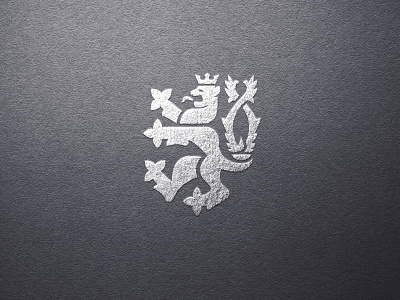
CZECH LION LOGO
I made this last year and I'm still proud. But I would make a few changes, the lion itself is very simplified but the tails are too detailed. So it makes the arms fat. It still works tho. Every few months I look at my old work and it is unbelievable how much Im getting better. What I thought is cool then, now it's bad and I would do much better work. So work on yourself and the results will come soon enough.
What would you change on this logo? Let me know:)
More by Matouš Švéda View profile
Like
