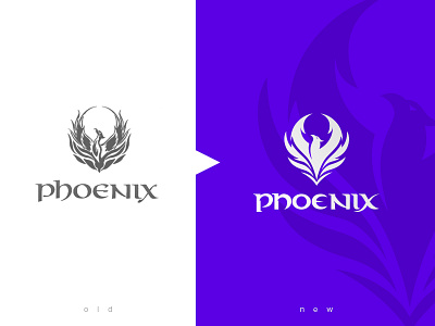
Redesign Phoenix - Hookah/Club Bar
Hi dear Dribbblers,
recently I was in my local hookah bar enjoying the smoking and I've always thought of their logo and their overall design on the menu cards and all that stuff.
I decided to take it as a challenge and redesign their brand in every form. Starting with the logo, making it simpler, modern and add more variety of usage to it (got some more mock ups coming soon).
The main issue with the logo I had was its complexity. I mean come on we live in 2019 logos like those dont work that well, especially if they are not made properly. Kinda looks like a tattooish logo or simple stock vector/photo from the web which just looks like a phoenix but without any meaning.
I added some flow into the logo and removed those changing gaps in the logo and those unnecessary details to identify it as a phoenix.
In addition to that I changed the wordmark of the logo too. It wasn't really well done and felt like a font used to write down phoenix. Again I simplified that and changed some words slightly to make it look more modern.
Let me know what you think about it! Anything you would have changed?
