Checkout on an iPad
I did this on the train home, so naturally I ran out of time to fix it. I'm embracing the flaws and think that the vision I had for this was on to something.
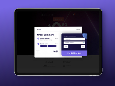
I wanted to try and respect the credit card format, but not go full skeuomorphic. I like the fat buttons and big inputs and the bold text.
I think the flow isn't very well thought out, and I'm unsure what payment this is for... but hey, it's the beauty of fast commuter design. :P
