Sign up form | onde.app
Shot 2. Sign up form for onde.app | Worked with @Valentin Sauts
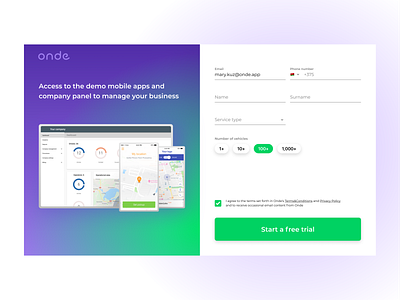
Page have 2 sections: illustration on left side and form on the right.
The main thing, that illustration and title do - motivate user to finish form, he see the goal and understand, what will have after. Green gradient make feeling, that light going from CTA button and focus user on it.
On the right side is asymmetrical form. I could make it symmetrical, but: 1) Things, that you can make without hiding in dropdown, should be visible. 2) Asymmetrical layout and different controls make form "alive". So, I decided to hide only "Phone number" and "Service type" field, and last one is editable dropdown, where user can choose from 7 options or write his variant. Checkbox for agreement of Terms&Conditions is near CTA button to make less weight of form and the user will not miss it.
