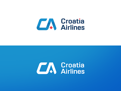
Croatia Airlines redesign concept
I thought it would be a fun challenge to redesign a Croatia Airlines logo, explore a few options and learn a thing or two in the process.
I wanted to create a more modern version of a logo but at the same time implement the most important characteristic of the current logo - red squares (which are the integral part of Croatian coat of arms).
Let me know what you think about this redesign. I appreciate any feedback :)
Please note that this is just a concept and not a real project. Croatia Airlines own the rights to their name and original logo.
More by Enio Jergović View profile
Like


