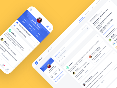
Daily UI Challenge #105 - LinkedIn clean up
I wanted to play around with the Eva UI Kit and was a tad irritated with LinkedIn, so I turned my frustrations into a quick design challenge.
Reducing the scope of a product is a lot more difficult than adding new features. Often, it's hard for companies to justify the time/effort spent, but I think there can be a ton of value in revisiting what the core purposes and strengths of a product are. I don't know much about LinkedIn's problem space, but I worked off my own experience/issue with the product as one of its users, so definitely a super biased redesign.
PS. If you're looking for a great UI kit to play with, check out Eva. It was fun to play with and had everything I needed for this challenge 👌
https://eva.design/
More by Ash Edmundson View profile
Like


