V Festival Rebrand
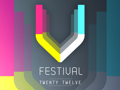
University Project -- The heavily influenced art deco styled logo is brought together through a distancing of colour that softly fades. The textures that layer the logo and the sharp points that follow around it appear industrial. The idea was simply to rebrand the festival’s identity through encouraging a contemporary revamp.
The ‘V’ itself originates from the font ‘Dekar’, however it has been reassembled and shortened to gain a more structured appearance. These design choices where made to follow a four palette colour scheme that reflects the ambience of the festival at night which is the most atmospheric part of any festival. It was then about eclectic design, asking myself how do I engage with the viewer to show motion while also highlighting noise? This lead to the distancing effect. Other choices came down to what worked better. For instance, ‘Twenty Twelve’ appeared much nicer visually that ‘2012’ while demin textures fitted the look.
Full project http://www.behance.net/gallery/V-Festival-Rebrand/4154489
