My Bartender
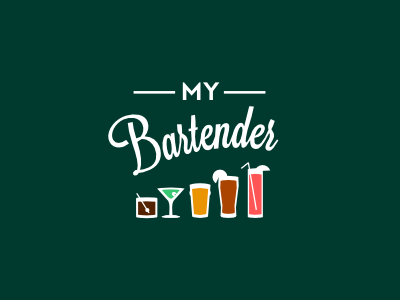
Version 4 of a logo for a new app designed for bartenders to let new and old patrons know when and where they're working while allowing patrons to find their favorite bartenders. The client requested a classic 1950's style harkening back to the days of Bogart in a white jacket. But yet it should be general enough to not exclude any gender or race, since the bartenders are a wide demographic. It should speak to the profession as a classy and craft oriented lifestyle, and show a resurgence of the pride in being a great bartender. The patrons are generally hip, young, and part of a night life scene. They love to use mobile apps to track the things they care about, and to connect with others. The client also mentioned the colors ivory and dark emerald green.
The client liked the script lettering of the earlier version, but wanted something that included a bit more variety, in particular for bartenders that mainly serve beer.
This concept is inspired by a rating system, mobile phone reception bars, and drinks lined up on the bar.

