Formula 1 Mobile App Concept: Standings Thought Process
My thoughts in designing this view
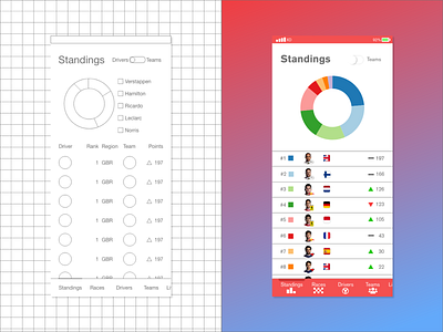
Tabular Data
In some respects, tabular data is boring, boring to display and boring to interact with; however, it exists to serve a purpose, and if your data is a natural fit for a table, use a table. If you are having trouble making your table look more interesting, I recommend this post. It is a great write-up and a resource I can see myself coming back to in the future. Good job Andrew Coyle
Removing Table Headers
This may be controversial, but I do not think table headers are always needed, particularly in this case. What we are designing is a mobile application for formula 1 fans to keep up-to-date with the latest news concerning their favorite drivers. Because this is being created as a mobile application and not as a PWA, this application would need to be installed directly onto a user's device, signifying his intention to use the application. Because our user is targeting fans of F1 directly and must be installed with intention, our users can be considered experts in our domain; therefore, the data and its meaning should be apparent to our users. The removal of the headers frees screen space to show our users useful information rather than static text. So, in this case, I said goodbye table headers.
Simplifying Table Columns
In the low fidelity mockup, team manufactures portraits (Mercedes, Ferrari, etc...) and driver portraits are separated into unique columns, but in the high fidelity mockup, the two columns are combined. The thought behind this combination is a result of two factors. One factor is the switch located in the top right of the screen. Users would, in this case, be able to see standings based the team manufacture rather than the drivers. In this view, it would most appropriate to give the company logos of the manufactures more dedication screen space, but in our current view, we are focused on the driver standings; therefore, we must remain focused. We still notify the users of who is driving for what team by shrinking the company logos and placing them next to the driver portraits.
The other factor to consider is also concerned with focus. Whitespace allows our table to breathe, allowing the user's eyes to group the table into sections. More on this below.
Whitespace
It is clear that our table has two defined section; one on the right, the other on the left. The left aligned data provides supplementary information to the right side's more dominant, primary information. Users are visiting this view of the application in order to discover where drivers in F1 currently stand in terms of points, therefore it makes sense to give the points and their differential signals room to breathe so that the user can easily find the data they intended to find when entering this view.
These are the most pressing thoughts for designing this view. There are other changes that are more obvious in hindsight. Obviously, the key/legend structure for the ring chart is much better in the high fidelity mockup versus the low fidelity mockup. In the low fidelity mockup, we would quickly run out of room for drivers on the ring chart, but by displaying color-coded keys within our table, we a have a much wider range of information to display. Region flags were introduced if only to remove some more of the text on the screen, and to provide some interesting color variations. As a bonus, fans of F1 come from around the globe, and discovering new drivers from their home country may be done easier provided a flag over an abbreviation for their country.
Thanks for reading! I hope you learned something as I did while created this view. Happy designing!

