LOGO | KLETKA DESIGN
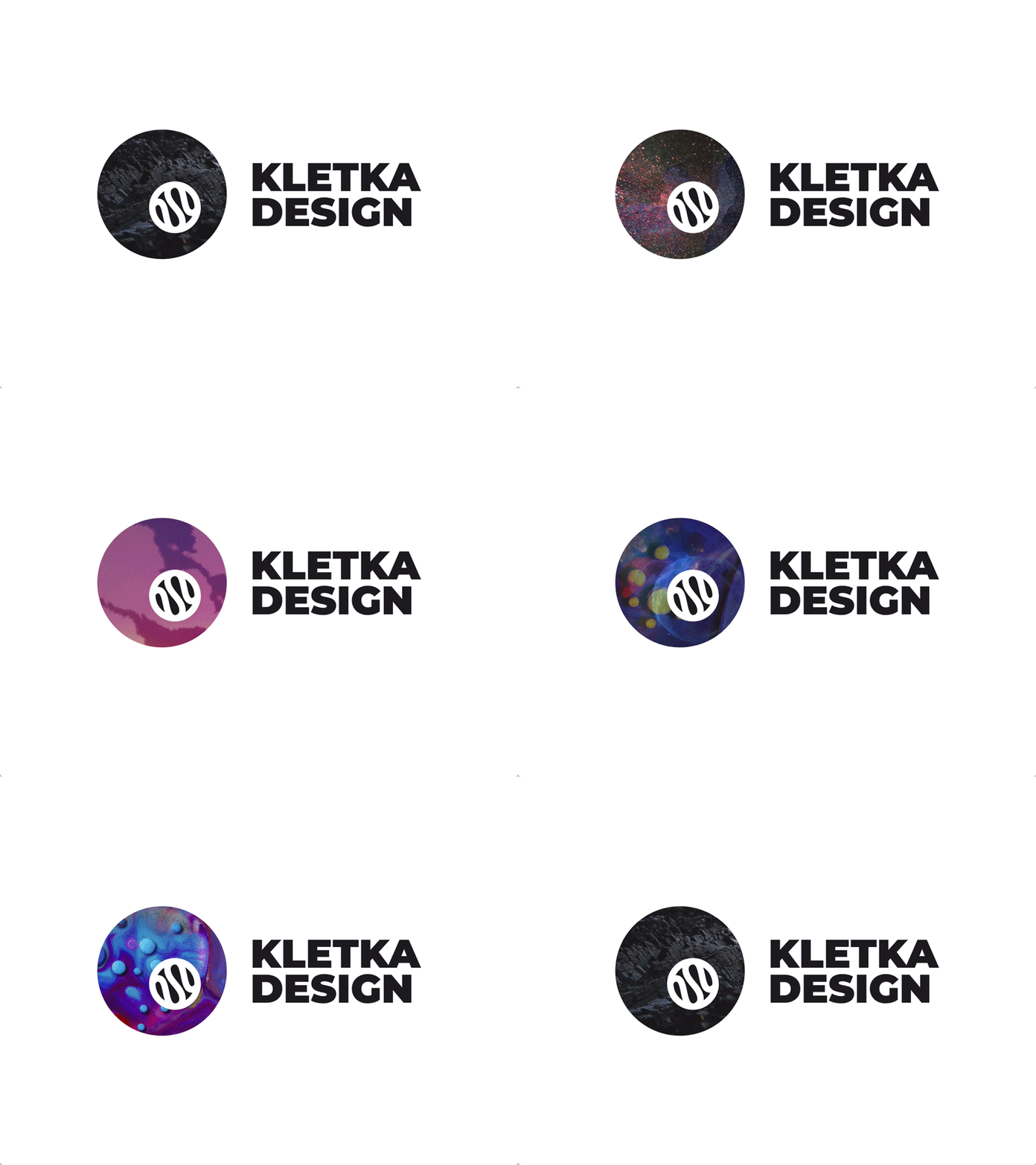
New logo of my own design studio.
KLETKA DESIGN.
In russian, word “KLETKA” has several meanings:
1. Cell (biology) — the smallest unit of life
2. Square (design) — a square is a regular quadrilateral, it has four equal sides and four equal
angles
After having perused the anatomy of a biological
cell, we came up with the main brand metaphor:
Our design studio is a biological cell, that is
constantly evolving.
There is nucleus inside of a cell. This nucleus is
our content, ideas and point of view.
We pass DNA of our style to clients, that helps to
differentiate themselves from the competition.
Full case: https://www.behance.net/gallery/81955503/LOGO-KLETKA-DESIGN
More by Nikita Ivanov View profile
Like
