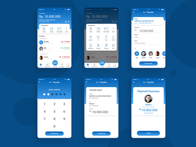
M-Bca Redesign Exercise
Hi, I'm a new player here :)
Big Thanks to @AYUSHI ASWAL For the invite!
-------
This is a UI redesign exercise for M-BCA
Concern:
-Easier access all the available features (especially checking balances, transaction history, and money transfer).
-Shorter steps to transfer money (the current application is having too many steps, just to transfer money and it feels annoying).
-A more modern look, (because the current interface looks old and outdated).
That's it for now, and feel free to leave a comment :)
Thank you
More by Gibran Ilham Ramadhan View profile
Like
