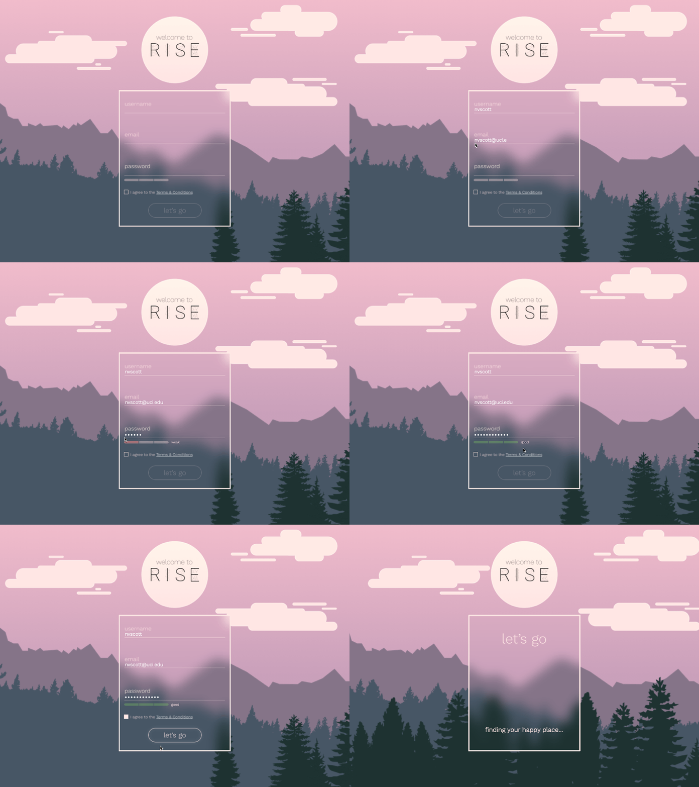
Daily UI #1 - Sign Up Screen
I decided to do this challenge to improve my skills and have some fun at the same time!
The first prompt was for a sign-up screen for some kind of service. I started by grabbing the color scheme from coolors.co and went from there! Initially I was thinking of a gentle alarm app, but as I kept working I think it became a bit more of a meditation tool.
I also took the chance to practice my parallaxing within Principle. I had some trouble with the frosted glass panel, as Principle doesn't support blur of any type. But overall I am pretty happy with the results, especially considering it was only a couple hours' work.
Thanks for looking!
More by Nessa V. Scott View profile
Like
