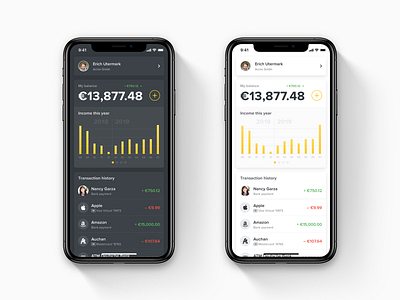
Mobile Wallet Homepage Concept
Hi, Dribbble!
I am developing a new complex design system for our platform. It designed to be a kind of for a new front-end framework in the future. For this purpose, I am experimenting with various types of mobile and web wallet designs. And this concept of a homepage born from one of these experiments, and I think I should share in on Dribbble.
This experiment comes from an idea, how the interface of the mobile wallet would look like if it's architecture had no tab bar.
I publish this concept in two stypes: for the dark and for the light theme. Moreover, I attach high-resolution images to this post.
Enjoy!
More by Yuri Ternytsky View profile
Like


