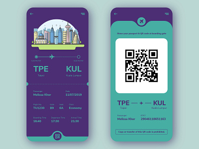
Boarding Pass Concept
Hello from day 24 challenge - Boarding Pass.
In my opinion, QR code composites with flight status might be hard for bar code scanner to scan on it, it may cause the process even slower. So I decided to make QR code in a new interface, scale it into proper size, and also easier for the attendant to scan through. Also, added some key passenger information for attendants easier to verify the correct info.
For color picking, I played with the combinations of blue and turquoise color. I think blue is complemented by the beautiful turquoise color.
Thanks for stopping by, any feedback and suggestions are appreciated. Hope you like it!
-
:: Day 24 :: Daily UI #024 #BoardingPass
:: Date :: 11 JUL 2019
Illustration credits to Vecteezy
More by Chloe Lim View profile
Like
