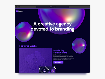
Polyfen | Visual Identity Update
We’ve updated some details of our visual identity to reflect a few changes in the direction of our business.
Since we’ve launched, it’s been a thrill to see our agency grow and evolve. We’ve set ambitious goals, we’ve faced obstacles, and we came out stronger.
Now, our team has grown in size, and our tribal culture has consolidated; We’ve established an online presence, and we’ve built strategic partnerships; We’ve had the pleasure to do work for some wonderful clients; And, we’ve even been developing a few promising internal projects, which we’ll be very soon publishing as sub-brands of our business.
In regards to our visual identity, we’ve replaced the previous typeface (“Intelo Alt”) we’ve selected for our logo and headlines in favour of a cleaner, more utilitarian typeface (“Biotif”) which can be used ubiquitously throughout our family of subsidiary brands.
We’ve also simplified our colour scheme by removing the beige hue we previously used for light backgrounds, in favour of a simpler, more cohesive monochrome palette.
Lastly, we’ve updated our website to offer a better user experience.
Check out the full case study › polyfen.com/case-study
Follow us:
› Instagram
› Behance
› Pinterest
› Twitter
› Facebook
› Linkedin
