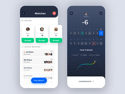
Light Mode + Interactive Scorecard
Playing with some ideas to spice up engagement by making scorecards more interactive for your own score, or someone else's that you've played a match with. Watching others' putts on the same hole could be fun.
Also, we've been living in the dark UI land for a long time and wanted to see what it might look like if we inverted it on the matches screen. Also took the opportunity to try some alternate layout ideas. I tend to think lighter works a little better with golf but not quite sure if it has to.
Like this new light style better or stick with dark?
More by Rick Messer View profile
Like


