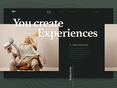
The New Zajno Website Animation
Yo!
Our new website is now nominated on Awwwards, FWA and CSSDA, so check it out and vote!
The idea to build a new website started to form about 2 years ago. However, as you may know prioritizing internal projects over client work can be quite challenging. That’s partially the reason why we needed to go through the 5 stages of grief from denial to acceptance up to the point of the new website being live. Read how we did it and learn a few tips here: https://medium.com/zajnocrew/the-five-stages-of-grief-how-we-finally-built-ourselves-a-new-website-3356f88b0f3b
Goals Stand out from the crowd that already stood out. Finding balance of pushing our style through while respecting the trends.
Approach This project has entered Zajno Record Book for the longest and most intense brainstorming sessions and best teamwork. By the way all the photo content was created entirely by us. The design was inspired by grunge posters and book covers. That explains where the big headings and overlapping elements come from. We’ve been pushing the limits of what’s assumed to be “normal” with this website like crazy. That’s the way AHA-AHA we like it at Zajno.
In terms of development, we significantly leveled up our skills, especially in taming Pixi.JS and learned the secret lore of optimization, which enabled us to create such an Easter Egg Danger Mode 👀
Results Holy shit, we made it! We’ve got us a creative, original and smoothly-working website where we realized the boldest of our dreams. So much love, time and effort have been put into it and that’s incredibly rewarding to see the website live.
Is this the next website of the day on Awwwards? I don’t know - you tell me. Vote here.
Press "L" to show some love!
ᗈ Join our Newsletter! ᗈ Website ᗈ TheGrid ᗈ Spotify ᗈ Twitter ᗈ Medium ᗈ Facebook ᗈ Instagram


