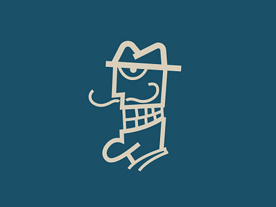
Dali's Dentech Symbol
Had to make a re-branding for Dali's Dentech stomatology starting with their symbolic caricature that has a big smile on it's face. The symbol was pretty outdated, they designed it in 1999 and it was a solid, good looking very iconic illustrative design.
Now they wanted to launch some products and logo failed on the packaging prints. The problem was that it came out unclear and it looked like a silhouette when it was scaled down and printed on different print materials. The logo contained too much details and thin lines. It was strong as character but not functional for print situations.
The caricature is really iconic and the owner got attached to the logo a lot. He wanted a re-brand, a simplified version if the caricature that still can represent their heritage.
The logo is modernized and simplified. Now it still has the strong iconic look but now it's a true icon because it got simplified.
Follow us:
Instagram: https://www.instagram.com/panter.vision/
CreativeMarket: https://creativemarket.com/pantervision
