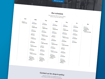
Schedule Page
For the scheduling page I didn't want the blocky calendar look. I chose to go with a take on the list format, I believe it kept the page visually appealing while focusing on usability. Let me know if you have any thoughts, thanks for looking!
More by Tuxedo UX View profile
Like

